Tuesday 29 March 2011

Portfolio Task 5- Graphic Design & Deconstruction


Lupton, E (2008) 'Thinking With Type'
of Graphic Design focusing on the aims of Deconstruction in Graphic Design.
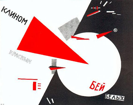
Possible designers to look at could be Richard Eckersley, David Carson, Allen Hori, Ed Fella or David Frej.


'Thinking with type' is a deconstructed breakdown of how text and typography are used and there functions when used to inform the public. Text and typography differ in their visual appearance ,purpose and outcome. Before typing technologies were about such as the printing press and computers, common mistakes were made in advertisements, articles and instruction Manuel's which in turn would have been disruptive and often rupture clear communication towards their audience, however this almost gave each deliverable a unique difference to their appearance visually. Common mistakes made were lack of regularity , kerning and unbalanced spacing between the text, which would rarely be seen in today's informative designs. 

Once print was introduced by Glutenberg in the 1450's there was a dramatic change. Books , posters and text in general were becoming much more invariable. This gave authority to authors as the text became their own, and allowed typographers to focus on minor imperfections made in a piece of text when producing them. This in turn created sense of fulfillment to all text in general arose but also concluded its purpose and outcome. 


Typography generated using print is known to be set out in a certain format which people claim to be blunt and rounded which leaved no room for interpreting meaning. Although not every reader looks at text in the same way. The obsessive organisation of a piece of text can distract the reader from the truth and emotion of the meaning. Simple and Modifications to the layout encourage this such as headers, footers, numbers, boarders, index and accents etc. This encourage the reader to follow the text 'like in a book' buy instructing them with features. 


Text plays a key role in the process of design, as a graphic designer  i am always looking for the best possible ways to communicate and engage my audience using typography and layout. Typography's main purpose is  'to help readers avoid reading' making it less of an effort for the reader to engage and understand what is trying to be communicated. Graphic designers do this by breaking down the masses of text , modifying them and laying the text out in the most readable way. 


Ed fella is known for his innovative responce and development to deconstructionist deisgn, the piece above This is a perfect example of one of his deconstructivist typography illustrations. The explosion of colour and variation of fonts and sizes is very innovative and shows his free spirited design style which i much prefer to the constructivist print like typography. It is quite un-clear which encourages the reader to look closer into the message to understand what the typographer is trying to portray by using this specific style.

'Typography gives words nostalgia, history or an aesthetic energy that seem right, just so, or just AMAZING!'
- Ed Fella 

http://www.oberholtzer-creative.com/visualculture/2008/12/quote-of-the-week-23/

ESSAY


Focussing on specific examples, describe the way that Modernist art & Design was a response to the forces of modernity?
In response to this, I will mainly be highlighting the great aesthetic reconstruction that was produced by artists throughout Germany in painting and graphic art throughout the 1900s and the 20th century. I will be focusing on the nature of modernist movements in Constructivism Expressionism, Bauhaus and the forces of opinions amongst Germany.
In the 19th century, the german population considered Modernity as an artist’s response to the changing social, political and cultural activities in their lives. The increasing changes to society encouraged a new attitude towards current artists; the effects of urbanization and industrialization were expressed through a new striking style of painting.
The unbelievable growth of cities had a great effect on the population in the 19th century when technology was at its best, this created a large shift in society and opened up a new world to urban and eventually even suburban workers. Life became fragmented and society was now secularization, the ‘city’ had now become the personification of modernism.
Great social changes affected Russia at this period, it was the time of the ‘Russian Revolution, 1917' and this was a great opportunity for art to progress. This shift in society effected contempoary designers/artists, giving them new inventive ideas and encouraged constructivists desires to make art more useful. Art became the base for constructing new society.
The use of techniques and abstract aesthetics were shown throughout the architecture, objects and art.  Replacing the old with the new was the way forward. This development of peoples aesthetic spoke out to the public about modernity, not just for the way they look, but also to make a statement.
This progress in advanced society had a big effect on the public; it created a new language for democratic and political subjects. Artists and designers used their work to express these views and to inform the public about the social changes in their lives in an abstracted and symbolic way.

One of El Lissitzy pieces of the 19th century,  Beat The Whites With The Red Wedge is a very good example of this , It was seen as a symbol of power and significant status for anti capitalism. Lissitzy painted this during the civil war, which explains the symbolistic colours red and white. He used shapes and colours to portray the conflict between the Bolshevik army(red wedge) and the anti-revolutionary forces (white circle). Red was a typical colour of revolution and  White was a typical color of the anti-revolutionary forces. The russian text is specifically placed and colored on opposing sides representing the publics strong opinions clashing during the civil war , on the right side it says Bey Belch Meaning "Beat Whites" and on the left Kaneohe kpachnim ''White is right''.
The propaganda poster had a great effect on the public and still does to this day,it shows the persuasion of positive and negative towards its targeted audience. Portraying such a powerful message through visuals, the viewers were drawn into the political debate through a new method which became more popular in artists throughout the 19th century, known as 'Graphic Design'. It was at this time when El Lissitzy fell into this way of working up until the 30's. He became an innovator of graphic art, modern typography and photomontage.

'The artist constructs a new symbol with his brush. This symbol is not a recognizable form of anything that is already finished, already made, or already existent in the world — it is a symbol of a new world, which is being built upon and which exists by the way of the people'

But where did El Lissitzkys influences for supremalist art come from? It was the Bauhaus that caught his attention at this particular period, the factory for modern design. The school influenced allot of graphic designers in the 19th century and also allot of the 20th century modern art. Along with other assets, the school taught typography and this was where sans-serif typography was created which was an alternative to the heavy German standard of black-letter typography shown in some of Lissitzkys work from the 19th century. It was also the constructivism art movements at the time that had a great influence on lissitzy modernist designs The movements with origins in Russia at the time were increasing and this was a great opportunity for new art inspiration and communication in Lissitzky's designs.

'Constructivism is a Russian version of Modernism. It was a revolutionary movement in art, caused by the social and industrial revolutions of the 19th 20th centuries'

El Lissitzy continued to create more designs that had a great effect on Germanys population and their views towards the changing political and democratic events in the 20th century. People were influenced by constructivism. Modernist art was meant to serve the social purpose , it was created to serve all people and be practical in its nature.

'Russia became a breeding ground for the revolution and at itself'


At a similar period during the russian revolution , a riot broke out involving the government , the public. Political view's clashed and all hell broke loose, this was referred to as the February Revolution. What was interesting about this event is that the protest got out of hand and troops had to be called in,  but instead of shooting at the rioters, the troops joined in to their protests and with no army to protect him, Tsar Nicholas 'emperor and autocrat of the russians' abandon his throne and his advisors resigned.


Looking at a contrast in art and design during the 19-20th century, Boris Kustodiev, a local russian painter responded to the democratic and political views using art in a more traditional way.

The Russian Revolution shook the foundations of society, which encouraged a vivid response in the artist's soul. He produced his own interpretation of the riot using oil based paints on canvas, 'the bolshevik'. Kustodiev wanted to communicate the statuses of power and democracy using colour and image. The painting is very symbolic to the revolution as there is an obvious use of red 'in the large flag that the giant is carrying' the colour red was chosen by the bolsheviks as their symbolistic colour representing 'blood' this marked workers and peasants 'anything red is a part of us', Higher classed citizens were usually painters and soldiers. 60% of Russia population were illiterate , Kustodiev wanted to convey the visual methods of their power using symbolic colours and unreal imagery in his painting.

The giant man in the middle of the protest is dressed like an average man, this could be a metaphor showing the collective strength of men creates power 'the riot,' this makes the audience rely on the visual propaganda at the time as it does not have the same connotation as it does nowadays.


These works reveal the captivating and complex ways in which artists responded to the forces of modernity and their personal relationships in contemporary society, culture and politics. The work that was produced by both artists gave the constructivists optimism about the future. Lissitsky and Kustodiev created new visual style's that was a revolution and linked to the political movement. This created a whole new style In typography, painting and colour which they then used in their works in an abstracted and symbolic way.

'Today we call the revolution 'Modernism' , Constructivism was Russia's version for that.'


REFERENCING


QUOTES
(1)book- Stedelijk Van Abbemuseum and El Lissitzy. El Lissitzy, 1890–1941: Architect Painter Photographer Typographer. Municipal Van Abbemuseum, 1990. 
(2) Constructivism is a Russian version of Modernism. It was a revolutionary movement in art, caused by the social and industrial revolutions of the 19th 20th centuries.'Mikhail' — http://www.youtube.com/watch?v=mQURCU6jN58&feature=related
(3) Russia became a breeding ground for the revolution and at itself 'Milkhail'http://www.youtube.com/watch?v=mQURCU6jN58&feature=related
web-  http://www.abcgallery.com/K/kustodiyev/kustodiyevbio.html
(4) Today we call the revolution 'Modernism' , Constructivism was Russia's version for that ' Milkhail' 2004

web-  http://books.google.com/books?id=LiIMkx5yAFQC&printsec=frontcover&dq=explanation+of+boris+kustodiev+the+bolshevik&source=Bel&ots=OD_H4ygjGQ&sig=toZWt9ikovK6IUICnwwHS-XJVk0&hl=en&Eli=oyVATZXsKo-ahQe9t6GoCA&sa=X&oi=book_result&ct=result&resnum=10&ved=0CFgQ6AEwCQ#v=onepage&q&f=false

web-  http://shkrobius.livejournal.com/2005/08/26/

book-  Anti-Bolshevik Communism by Paul mattick jR. 

book-  The Russian Revolution and Bolshevik Victory: Visions and Revisions by Ronald Grigor Suny

book- Modernism: Designing a New World : 1914-1939 'christopher wilk'

Video , research for essay task

RussianConstructivism


Monday 28 March 2011

Portfolio Task 3- Avant Gardism


In approximately 300 words discuss the concept of the 'Avant Garde' in relation to two examples of Graphic Design. Include pictures and full references to the works you are discussing. 


Avant Gard is seen as being an ongoing contemporary art direction that is unfamiliar and fresh. It is often used to create a reaction or emotion that is controversial to its intention like an advertisement or promotion. This is not always taken to satisfaction by its audience, but can have a great impact on the society as a whole.
As a graphic designer i come across examples of this everyday which inspires and guides me and my relation to graphic design.
Adbusters is a great website for discovering examples of Avant Gard ism which is where i found two particular pieces of advertisement that came to
my attention. 


'Asolute on Ice', Adbusters

http://www.adbusters.org/content/absolut-ice


This ad is very effective. As soon as i engaged with the poster i felt a 
sense of mortality. 
Even though it is just a foot, your mind relates to the label and white sheet 
, portraying death. I felt i wanted to know more about what the poster was 
trying to communicate, as it was evidently negative.
I then related to the generic typeface of 'Absolute Vodka' and associated it 
with joyful experiences, the use of Avant Gard ism is clearly used her as 
the image and text contradict each other. 
Instead of promoting the positive effects and promotion of the product, the 
poster does the opposite and communicates the truths about the alcohol. 
this is also shown in the facts about the effects it has on its audience in 
small print underneath the footer. 


08_adbusters_brand_baby


http://www.adpunch.org/entry/most-interesting-parody-ads-in-the-world/


This photograph of a mother breast feeding her which appears to be
tattooed child is not a parody of any particular brand although the baby is 
covered in branded names. This shocking image almost reflects the 
dominance of brands on the collective social individual.
I see it as a metaphor, 'the baby suckling on the teet of consumerism'


As a graphic designer i have become much more aware of Avan Gard ism. The combination of imagery and text related to its audience is a key importance for communicating a strong issue or subject.